Mastering the Art of Thumbnails with Thumbz Studio

YouTube thumbnails are your video’s first impression, and they can make or break your click-through rate (CTR). To ensure your thumbnails entice viewers and boost your video’s success, it’s essential to understand the dos and don’ts of thumbnail design. In this comprehensive guide, we’ll explore the proven strategies for creating effective thumbnails and introduce you to Thumbz Studio, a platform that simplifies the thumbnail design process and helps you craft compelling visuals.
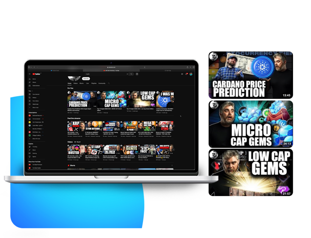
(Show thumbs studio YT Thumbnail SS and show canva YT Thumbnails SS)
The Do’s: Creating Winning Thumbnails
Let’s start with the thumbnail do’s—the strategies that lead to click-worthy and successful thumbnails:
1. High-Quality Imagery:

Do use high-resolution images that are clear and engaging. Viewers are drawn to visually appealing thumbnails.
2. Contrasting Colors:

Do use contrasting colors for text and graphics to make them pop and enhance visibility.
3. Engaging Text:

Do include concise, impactful text that complements your visuals and sparks curiosity.
4. Faces and Emotions:

Do incorporate human faces and expressions when relevant. Faces can connect with viewers on an emotional level.
5. Consistency:

Do maintain a consistent look and style across your thumbnails. This builds brand recognition and trust.
6. Relevance:

Do ensure that your thumbnail accurately represents your video’s content. Misleading thumbnails can
The Don’ts: Thumbnail Pitfalls to Avoid
7. Now, let’s explore the thumbnail don’ts—common mistakes that can hinder your success on YouTube:
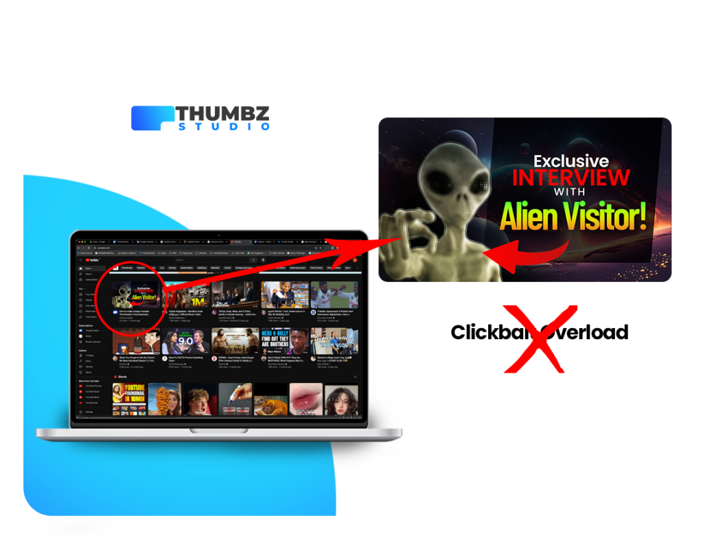
1. Clickbait Overload:

Don’t use clickbait tactics that mislead viewers. While curiosity is good, deception is not.
Show example
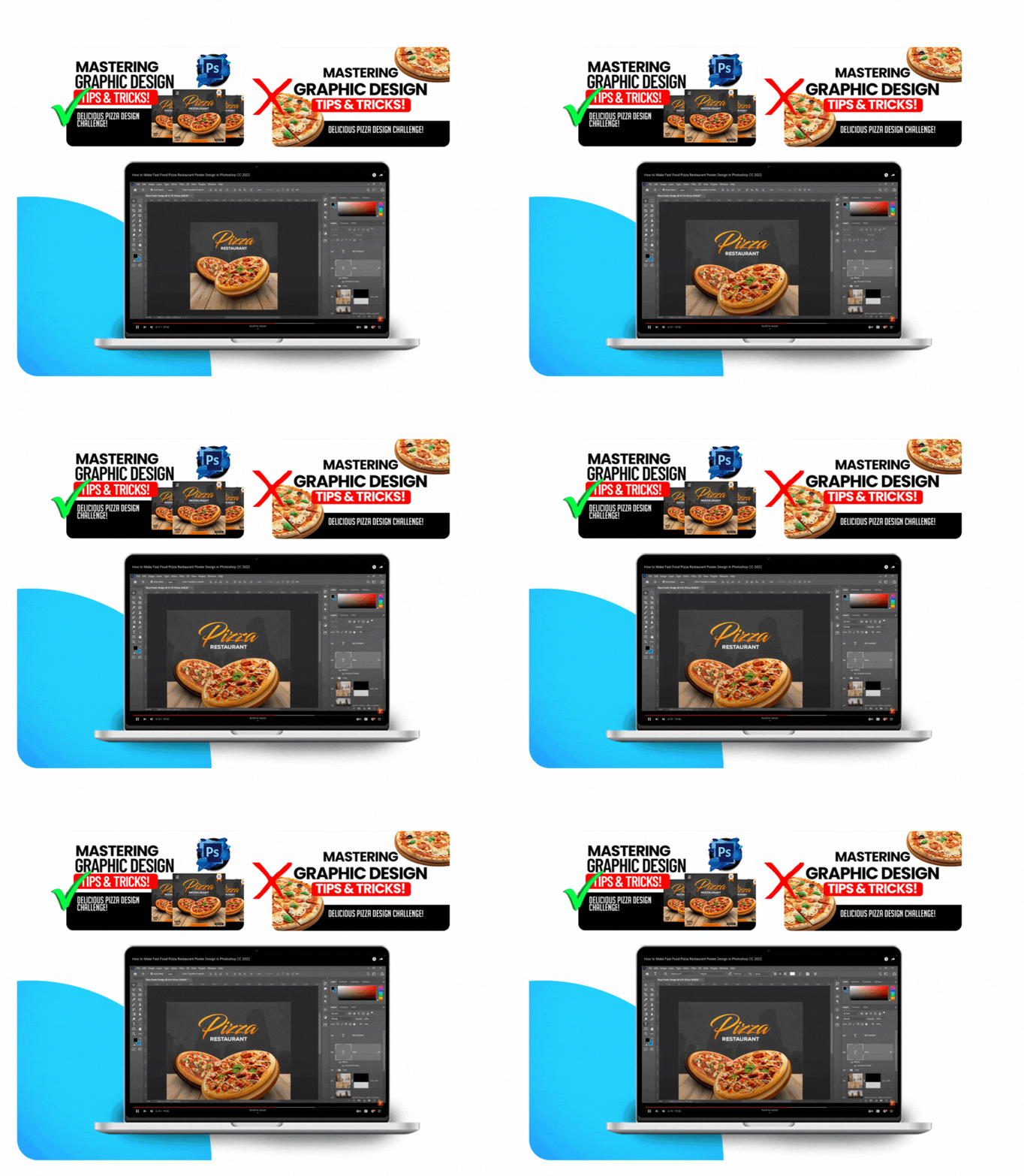
2. Cluttered Design:

Don’t overcrowd your thumbnail with too much text or too many elements. Keep it clean and visually balanced.Show example
3. Low-Quality Imagery:

Don’t use blurry or pixelated images. Poor image quality can deter viewers.Show example
4. Inconsistent Branding:

Don’t deviate from your established branding elements. Consistency is key for brand recognition.Show example
5. Irrelevant Imagery:

Don’t use images or graphics that have little to do with your video’s content. This can confuse viewers.Show example
6. Overwhelming Text:

Don’t overwhelm your thumbnail with text. Use text sparingly and make it easy to read.Show example
Thumbz Studio: Streamlining Thumbnail Success
8. Thumbz Studio is a powerful platform that streamlines the thumbnail design process and helps you implement the thumbnail do’s while avoiding the don’ts: Show thumbzstudio

9. Diverse Templates: Thumbz Studio offers a variety of customizable thumbnail templates designed by professionals, ensuring that your thumbnails align with the do’s of successful thumbnails. Thumbzstudio cover

User-Friendly Customization: Easily modify templates to match your brand and video style. Customize text, insert images, and tweak elements intuitively.
Professional Design: Templates on Thumbz Studio are created to maximize visual appeal and engagement.
Measuring Thumbnail Success
To gauge the effectiveness of your thumbnails, monitor metrics like CTR and viewer retention. Experiment with different thumbnail styles, analyze performance data, and refine your approach accordingly.
Conclusion: Mastering Thumbnail Strategy
Creating successful thumbnails on YouTube is an art and a science. By understanding and implementing the thumbnail do’s, avoiding the don’ts, and utilizing tools like Thumbz Studio, you can significantly increase your video’s CTR, attract more viewers, and achieve greater success on the platform.
Ready to master the art of thumbnails? Explore Thumbz Studio and create compelling visuals that drive success!


